

With conventional fuel cells as their model, researchers learned to use similar chemical reactions to make a fuel from microbes in pee.
Plus, urine contains water, phosphorus, potassium and nitrogen, the key ingredients plants need to grow and survive. Human urine could replace about 25 percent of current nitrogen and phosphorous fertilizers worldwide and could save water for gardens and crops. The average U.S. resident flushes a toilet bowl containing only pee and paper about six to seven times a day, which adds up to about 3,500 gallons of water down per year. Plus cows in the U.S. produce 231 gallons of the stuff each year.
Pee power
A conventional fuel cell uses chemical reactions to produce energy, as electrons move from one electrode to another to power a lightbulb or phone. Ioannis Ieropoulos, a professor and chair of Environmental Engineering at the University of Southampton in England, realized the same type of reaction could be used to make a fuel from microbes in pee.
Bacterial species like Shewanella oneidensis and Pseudomonas aeruginosa can consume carbon and other nutrients in urine and pop out electrons as a result of their digestion. In a microbial fuel cell, one electrode is covered in microbes, immersed in urine and kept away from oxygen. Another electrode is in contact with oxygen. When the microbes feed on nutrients, they produce the electrons that flow through the circuit from one electrod to another to combine with oxygen on the other side. As long as the microbes have fresh pee to chomp on, electrons keep flowing. And after the microbes are done with the pee, it can be used as fertilizer.
These microbes are easily found in wastewater treatment plants, ponds, lakes, rivers or soil. Keeping them alive is the easy part, says Ieropoulos. Once the cells start producing stable power, his group sequences the microbes and keeps using them.
Like many promising technologies, scaling these devices for mass consumption won’t be easy, says Kevin Orner, a civil engineering professor at West Virginia University. But it’s moving in the right direction. Ieropoulos’s device has shrunk from the size of about three packs of cards to a large glue stick. It looks and works much like a AAA battery and produce about the same power. By itself, the device can barely power a light bulb, but when stacked together, they can do much more—just like photovoltaic cells in solar panels. His lab has produced 1760 fuel cells stacked together, and with manufacturing support, there’s no theoretical ceiling, he says.
Although pure urine produces the most power, Ieropoulos’s devices also work with the mixed liquids of the wastewater treatment plants, so they can be retrofit into urban wastewater utilities.
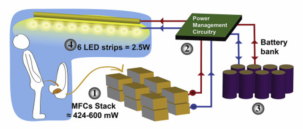
This image shows how the pee-powered system works. Pee feeds bacteria in the stack of fuel cells (1), which give off electrons (2) stored in parallel cylindrical cells (3). These cells are connected to a voltage regulator (4), which smooths out the electrical signal to ensure consistent power to the LED strips lighting the toilet.
Courtesy Ioannis Ieropoulos
Key to the long-term success of any urine reclamation effort, says Orner, is avoiding what he calls “parachute engineering”—when well-meaning scientists solve a problem with novel tech and then abandon it. “The way around that is to have either the need come from the community or to have an organization in a community that is committed to seeing a project operate and maintained,” he says.
Success with urine reclamation also depends on the economy. “If energy prices are low, it may not make sense to recover energy,” says Orner. “But right now, fertilizer prices worldwide are generally pretty high, so it may make sense to recover fertilizer and nutrients.” There are obstacles, too, such as few incentives for builders to incorporate urine recycling into new construction. And any hiccups like leaks or waste seepage will cost builders money and reputation. Right now, Orner says, the risks are just too high.
Despite the challenges, Ieropoulos envisions a future in which urine is passed through microbial fuel cells at wastewater treatment plants, retrofitted septic tanks, and building basements, and is then delivered to businesses to use as agricultural fertilizers. Although pure urine produces the most power, Ieropoulos’s devices also work with the mixed liquids of the wastewater treatment plants, so they can be retrofitted into urban wastewater utilities where they can make electricity from the effluent. And unlike solar cells, which are a common target of theft in some areas, nobody wants to steal a bunch of pee.
When Ieropoulos’s team returned to wrap up their pilot project 18 months later, the school’s director begged them to leave the fuel cells in place—because they made a major difference in students’ lives. “We replaced it with a substantial photovoltaic panel,” says Ieropoulos, They couldn’t leave the units forever, he explained, because of intellectual property reasons—their funders worried about theft of both the technology and the idea. But the photovoltaic replacement could be stolen, too, leaving the girls in the dark.
The story repeated itself at another school, in Nairobi, Kenya, as well as in an informal settlement in Durban, South Africa. Each time, Ieropoulos vowed to return. Though the pandemic has delayed his promise, he is resolute about continuing his work—it is a moral and legal obligation. “We've made a commitment to ourselves and to the pupils,” he says. “That's why we need to go back.”
Urine as fertilizer
Modern day industrial systems perpetuate the broken cycle of nutrients. When plants grow, they use up nutrients the soil. We eat the plans and excrete some of the nutrients we pass them into rivers and oceans. As a result, farmers must keep fertilizing the fields while our waste keeps fertilizing the waterways, where the algae, overfertilized with nitrogen, phosphorous and other nutrients grows out of control, sucking up oxygen that other marine species need to live. Few global communities remain untouched by the related challenges this broken chain create: insufficient clean water, food, and energy, and too much human and animal waste.
The Rich Earth Institute in Vermont runs a community-wide urine nutrient recovery program, which collects urine from homes and businesses, transports it for processing, and then supplies it as fertilizer to local farms.
One solution to this broken cycle is reclaiming urine and returning it back to the land. The Rich Earth Institute in Vermont is one of several organizations around the world working to divert and save urine for agricultural use. “The urine produced by an adult in one day contains enough fertilizer to grow all the wheat in one loaf of bread,” states their website.
Notably, while urine is not entirely sterile, it tends to harbor fewer pathogens than feces. That’s largely because urine has less organic matter and therefore less food for pathogens to feed on, but also because the urinary tract and the bladder have built-in antimicrobial defenses that kill many germs. In fact, the Rich Earth Institute says it’s safe to put your own urine onto crops grown for home consumption. Nonetheless, you’ll want to dilute it first because pee usually has too much nitrogen and can cause “fertilizer burn” if applied straight without dilution. Other projects to turn urine into fertilizer are in progress in Niger, South Africa, Kenya, Ethiopia, Sweden, Switzerland, The Netherlands, Australia, and France.
Eleven years ago, the Institute started a program that collects urine from homes and businesses, transports it for processing, and then supplies it as fertilizer to local farms. By 2021, the program included 180 donors producing over 12,000 gallons of urine each year. This urine is helping to fertilize hay fields at four partnering farms. Orner, the West Virginia professor, sees it as a success story. “They've shown how you can do this right--implementing it at a community level scale."