

In a recent research trial, patients with Parkinson's disease reported that their symptoms had improved after stem cells were implanted into their brains. Martin Taylor, far right, was diagnosed at age 32.
For years, there's been little improvement in the standard treatment. Patients are typically given the drug levodopa, a chemical that's absorbed by the brain’s nerve cells, or neurons, and converted into dopamine. This drug addresses the symptoms but has no impact on the course of the disease as patients continue to lose dopamine producing neurons. Eventually, the treatment stops working effectively.
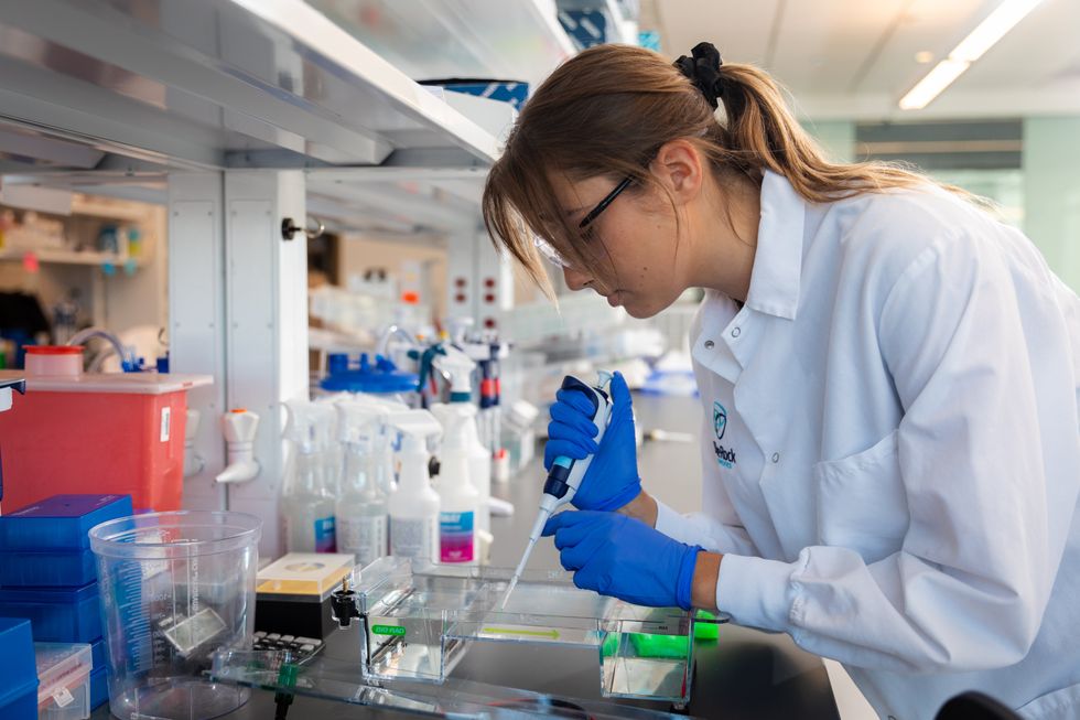
BlueRock Therapeutics, a cell therapy company based in Massachusetts, is taking a different approach by focusing on the use of stem cells, which can divide into and generate new specialized cells. The company makes the dopamine-producing cells that patients have lost and inserts these cells into patients' brains. “We have a disease with a high unmet need,” says Ahmed Enayetallah, the senior vice president and head of development at BlueRock. “We know [which] cells…are lost to the disease, and we can make them. So it really came together to use stem cells in Parkinson's.”
In a phase 1 research trial announced late last month, patients reported that their symptoms had improved after a year of treatment. Brain scans also showed an increased number of neurons generating dopamine in patients’ brains.
Increases in dopamine signals
The recent phase 1 trial focused on deploying BlueRock’s cell therapy, called bemdaneprocel, to treat 12 patients suffering from Parkinson’s. The team developed the new nerve cells and implanted them into specific locations on each side of the patient's brain through two small holes in the skull made by a neurosurgeon. “We implant cells into the places in the brain where we think they have the potential to reform the neural networks that are lost to Parkinson's disease,” Enayetallah says. The goal is to restore motor function to patients over the long-term.
Five patients were given a relatively low dose of cells while seven got higher doses. Specialized brain scans showed evidence that the transplanted cells had survived, increasing the overall number of dopamine producing cells. The team compared the baseline number of these cells before surgery to the levels one year later. “The scans tell us there is evidence of increased dopamine signals in the part of the brain affected by Parkinson's,” Enayetallah says. “Normally you’d expect the signal to go down in untreated Parkinson’s patients.”
"I think it has a real chance to reverse motor symptoms, essentially replacing a missing part," says Tilo Kunath, a professor of regenerative neurobiology at the University of Edinburgh.
The team also asked patients to use a specific type of home diary to log the times when symptoms were well controlled and when they prevented normal activity. After a year of treatment, patients taking the higher dose reported symptoms were under control for an average of 2.16 hours per day above their baselines. At the smaller dose, these improvements were significantly lower, 0.72 hours per day. The higher-dose patients reported a corresponding decrease in the amount of time when symptoms were uncontrolled, by an average of 1.91 hours, compared to 0.75 hours for the lower dose. The trial was safe, and patients tolerated the year of immunosuppression needed to make sure their bodies could handle the foreign cells.
Claire Bale, the associate director of research at Parkinson's U.K., sees the promise of BlueRock's approach, while noting the need for more research on a possible placebo effect. The trial participants knew they were getting the active treatment, and placebo effects are known to be a potential factor in Parkinson’s research. Even so, “The results indicate that this therapy produces improvements in symptoms for Parkinson's, which is very encouraging,” Bale says.
Tilo Kunath, a professor of regenerative neurobiology at the University of Edinburgh, also finds the results intriguing. “I think it's excellent,” he says. “I think it has a real chance to reverse motor symptoms, essentially replacing a missing part.” However, it could take time for this therapy to become widely available, Kunath says, and patients in the late stages of the disease may not benefit as much. “Data from cell transplantation with fetal tissue in the 1980s and 90s show that cells did not survive well and release dopamine in these [late-stage] patients.”
Searching for the right approach
There's a long history of using cell therapy as a treatment for Parkinson's. About four decades ago, scientists at the University of Lund in Sweden developed a method in which they transferred parts of fetal brain tissue to patients with Parkinson's so that their nerve cells would produce dopamine. Many benefited, and some were able to stop their medication. However, the use of fetal tissue was highly controversial at that time, and the tissues were difficult to obtain. Later trials in the U.S. showed that people benefited only if a significant amount of the tissue was used, and several patients experienced side effects. Eventually, the work lost momentum.
“Like many in the community, I'm aware of the long history of cell therapy,” says Taylor, the patient living with Parkinson's. “They've long had that cure over the horizon.”
In 2000, Lorenz Studer led a team at the Memorial Sloan Kettering Centre, in New York, to find the chemical signals needed to get stem cells to differentiate into cells that release dopamine. Back then, the team managed to make cells that produced some dopamine, but they led to only limited improvements in animals. About a decade later, in 2011, Studer and his team found the specific signals needed to guide embryonic cells to become the right kind of dopamine producing cells. Their experiments in mice, rats and monkeys showed that their implanted cells had a significant impact, restoring lost movement.
Studer then co-founded BlueRock Therapeutics in 2016. Forming the most effective stem cells has been one of the biggest challenges, says Enayetallah, the BlueRock VP. “It's taken a lot of effort and investment to manufacture and make the cells at the right scale under the right conditions.” The team is now using cells that were first isolated in 1998 at the University of Wisconsin, a major advantage because they’re available in a virtually unlimited supply.
Other efforts underway
In the past several years, University of Lund researchers have begun to collaborate with the University of Cambridge on a project to use embryonic stem cells, similar to BlueRock’s approach. They began clinical trials this year.
A company in Japan called Sumitomo is using a different strategy; instead of stem cells from embryos, they’re reprogramming adults' blood or skin cells into induced pluripotent stem cells - meaning they can turn into any cell type - and then directing them into dopamine producing neurons. Although Sumitomo started clinical trials earlier than BlueRock, they haven’t yet revealed any results.
“It's a rapidly evolving field,” says Emma Lane, a pharmacologist at the University of Cardiff who researches clinical interventions for Parkinson’s. “But BlueRock’s trial is the first full phase 1 trial to report such positive findings with stem cell based therapies.” The company’s upcoming phase 2 research will be critical to show how effectively the therapy can improve disease symptoms, she added.
The cure over the horizon
BlueRock will continue to look at data from patients in the phase 1 trial to monitor the treatment’s effects over a two-year period. Meanwhile, the team is planning the phase 2 trial with more participants, including a placebo group.
For patients with Parkinson’s like Martin Taylor, the therapy offers some hope, though Taylor recognizes that more research is needed.
BlueRock Therapeutics
“Like many in the community, I'm aware of the long history of cell therapy,” he says. “They've long had that cure over the horizon.” His expectations are somewhat guarded, he says, but, “it's certainly positive to see…movement in the field again.”
"If we can demonstrate what we’re seeing today in a more robust study, that would be great,” Enayetallah says. “At the end of the day, we want to address that unmet need in a field that's been waiting for a long time.”
Editor's note: The company featured in this piece, BlueRock Therapeutics, is a portfolio company of Leaps by Bayer, which is a sponsor of Leaps.org. BlueRock was acquired by Bayer Pharmaceuticals in 2019. Leaps by Bayer and other sponsors have never exerted influence over Leaps.org content or contributors.

Sparklers produce a beautiful display of light and heat by burning metal dust, which contains iron. The recent work of Canadian and Dutch researchers suggests we can use iron as a cheap, carbon-free fuel.
Iron as a fuel
Iron is abundantly available and cheap. More importantly, the byproduct of burning iron is rust (iron oxide), a solid material that is easy to collect and recycle. Neither burning iron nor converting its oxide back produces any carbon in the process.
Iron oxide is potentially renewable by reacting with electricity or hydrogen to become iron again.
Iron has a high energy density: it requires almost the same volume as gasoline to produce the same amount of energy. However, iron has poor specific energy: it’s a lot heavier than gas to produce the same amount of energy. (Think of picking up a jug of gasoline, and then imagine trying to pick up a similar sized chunk of iron.) Therefore, its weight is prohibitive for many applications. Burning iron to run a car isn’t very practical if the iron fuel weighs as much as the car itself.
In its powdered form, however, iron offers more promise as a high-density energy carrier or storage system. Iron-burning furnaces could provide direct heat for industry, home heating, or to generate electricity.
Plus, iron oxide is potentially renewable by reacting with electricity or hydrogen to become iron again (as long as you’ve got a source of clean electricity or green hydrogen). When there’s excess electricity available from renewables like solar and wind, for example, rust could be converted back into iron powder, and then burned on demand to release that energy again.
However, these methods of recycling rust are very energy intensive and inefficient, currently, so improvements to the efficiency of burning iron itself may be crucial to making such a circular system viable.
The science of discrete burning
Powdered particles have a high surface area to volume ratio, which means it is easier to ignite them. This is true for metals as well.
Under the right circumstances, powdered iron can burn in a manner known as discrete burning. In its most ideal form, the flame completely consumes one particle before the heat radiating from it combusts other particles in its vicinity. By studying this process, researchers can better understand and model how iron combusts, allowing them to design better iron-burning furnaces.
Discrete burning is difficult to achieve on Earth. Perfect discrete burning requires a specific particle density and oxygen concentration. When the particles are too close and compacted, the fire jumps to neighboring particles before fully consuming a particle, resulting in a more chaotic and less controlled burn.
Presently, the rate at which powdered iron particles burn or how they release heat in different conditions is poorly understood. This hinders the development of technologies to efficiently utilize iron as a large-scale fuel.
Burning metal in microgravity
In April, the European Space Agency (ESA) launched a suborbital “sounding” rocket, carrying three experimental setups. As the rocket traced its parabolic trajectory through the atmosphere, the experiments got a few minutes in free fall, simulating microgravity.
One of the experiments on this mission studied how iron powder burns in the absence of gravity.
In microgravity, particles float in a more uniformly distributed cloud. This allows researchers to model the flow of iron particles and how a flame propagates through a cloud of iron particles in different oxygen concentrations.
Existing fossil fuel power plants could potentially be retrofitted to run on iron fuel.
Insights into how flames propagate through iron powder under different conditions could help design much more efficient iron-burning furnaces.
Clean and carbon-free energy on Earth
Various businesses are looking at ways to incorporate iron fuels into their processes. In particular, it could serve as a cleaner way to supply industrial heat by burning iron to heat water.
For example, Dutch brewery Swinkels Family Brewers, in collaboration with the Eindhoven University of Technology, switched to iron fuel as the heat source to power its brewing process, accounting for 15 million glasses of beer annually. Dutch startup RIFT is running proof-of-concept iron fuel power plants in Helmond and Arnhem.
As researchers continue to improve the efficiency of burning iron, its applicability will extend to other use cases as well. But is the infrastructure in place for this transition?
Often, the transition to new energy sources is slowed by the need to create new infrastructure to utilize them. Fortunately, this isn’t the case with switching from fossil fuels to iron. Since the ideal temperature to burn iron is similar to that for hydrocarbons, existing fossil fuel power plants could potentially be retrofitted to run on iron fuel.
This article originally appeared on Freethink, home of the brightest minds and biggest ideas of all time.