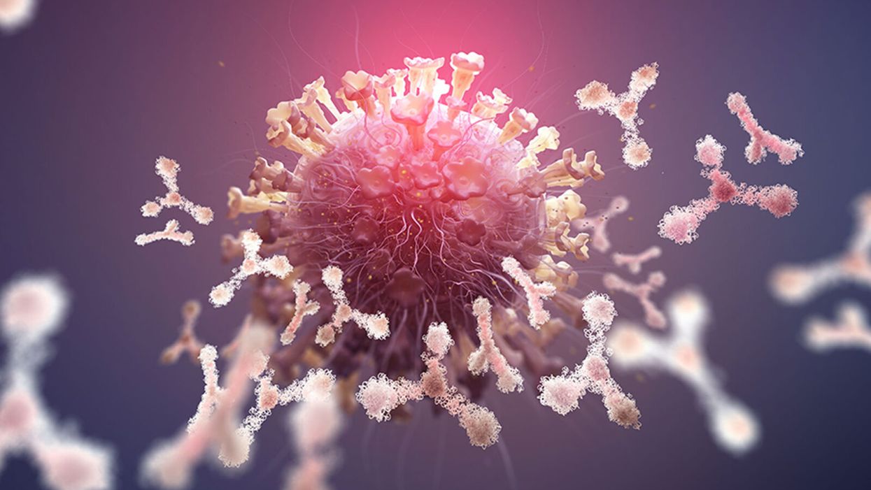
Clever Firm Predicts Patients Most at Risk, Then Tries to Intervene Before They Get Sicker
The diabetic patient hit the danger zone.
Ideally, blood sugar, measured by an A1C test, rests at 5.9 or less. A 7 is elevated, according to the Diabetes Council. Over 10, and you're into the extreme danger zone, at risk of every diabetic crisis from kidney failure to blindness.
In three months of working with a case manager, Jen's blood sugar had dropped to 7.2, a much safer range.
This patient's A1C was 10. Let's call her Jen for the sake of this story. (Although the facts of her case are real, the patient's actual name wasn't released due to privacy laws.).
Jen happens to live in Pennsylvania's Lehigh Valley, home of the nonprofit Lehigh Valley Health Network, which has eight hospital campuses and various clinics and other services. This network has invested more than $1 billion in IT infrastructure and founded Populytics, a spin-off firm that tracks and analyzes patient data, and makes care suggestions based on that data.
When Jen left the doctor's office, the Populytics data machine started churning, analyzing her data compared to a wealth of information about future likely hospital visits if she did not comply with recommendations, as well as the potential positive impacts of outreach and early intervention.
About a month after Jen received the dangerous blood test results, a community outreach specialist with psychological training called her. She was on a list generated by Populytics of follow-up patients to contact.
"It's a very gentle conversation," says Cathryn Kelly, who manages a care coordination team at Populytics. "The case manager provides them understanding and support and coaching." The goal, in this case, was small behavioral changes that would actually stick, like dietary ones.
In three months of working with a case manager, Jen's blood sugar had dropped to 7.2, a much safer range. The odds of her cycling back to the hospital ER or veering into kidney failure, or worse, had dropped significantly.
While the health network is extremely localized to one area of one state, using data to inform precise medical decision-making appears to be the wave of the future, says Ann Mongovern, the associate director of Health Care Ethics at the Markkula Center for Applied Ethics at Santa Clara University in California.
"Many hospitals and hospital systems don't yet try to do this at all, which is striking given where we're at in terms of our general technical ability in this society," Mongovern says.
How It Happened
While many hospitals make money by filling beds, the Lehigh Valley Health Network, as a nonprofit, accepts many patients on Medicaid and other government insurances that don't cover some of the costs of a hospitalization. The area's population is both poorer and older than national averages, according to the U.S. Census data, meaning more people with higher medical needs that may not have the support to care for themselves. They end up in the ER, or worse, again and again.
In the early 2000s, LVHN CEO Dr. Brian Nester started wondering if his health network could develop a way to predict who is most likely to land themselves a pricey ICU stay -- and offer support before those people end up needing serious care.
Embracing data use in such specific ways also brings up issues of data security and patient safety.
"There was an early understanding, even if you go back to the (federal) balanced budget act of 1997, that we were just kicking the can down the road to having a functional financial model to deliver healthcare to everyone with a reasonable price," Nester says. "We've got a lot of people living longer without more of an investment in the healthcare trust."
Popultyics, founded in 2013, was the result of years of planning and agonizing over those population numbers and cost concerns.
"We looked at our own health plan," Nester says. Out of all the employees and dependants on the LVHN's own insurance network, "roughly 1.5 percent of our 25,000 people — under 400 people — drove $30 million of our $130 million on insurance costs -- about 25 percent."
"You don't have to boil the ocean to take cost out of the system," he says. "You just have to focus on that 1.5%."
Take Jen, the diabetic patient. High blood sugar can lead to kidney failure, which can mean weekly expensive dialysis for 20 years. Investing in the data and staff to reach patients, he says, is "pennies compared to $100 bills."
For most doctors, "there's no awareness for providers to know who they should be seeing vs. who they are seeing. There's no incentive, because the incentive is to see as many patients as you can," he says.
To change that, first the LVHN invested in the popular medical management system, Epic. Then, they negotiated with the top 18 insurance companies that cover patients in the region to allow access to their patient care data, which means they have reams of patient history to feed the analytics machine in order to make predictions about outcomes. Nester admits not every hospital could do that -- with 52 percent of the market share, LVHN had a very strong negotiating position.
Third party services take that data and churn out analytics that feeds models and care management plans. All identifying information is stripped from the data.
"We can do predictive modeling in patients," says Populytics President and CEO Gregory Kile. "We can identify care gaps. Those care gaps are noted as alerts when the patient presents at the office."
Kile uses himself as a hypothetical patient.
"I pull up Gregory Kile, and boom, I see a flag or an alert. I see he hasn't been in for his last blood test. There is a care gap there we need to complete."
"There's just so much more you can do with that information," he says, envisioning a future where follow-up for, say, knee replacement surgery and outcomes could be tracked, and either validated or changed.
Ethical Issues at the Forefront
Of course, embracing data use in such specific ways also brings up issues of security and patient safety. For example, says medical ethicist Mongovern, there are many touchpoints where breaches could occur. The public has a growing awareness of how data used to personalize their experiences, such as social media analytics, can also be monetized and sold in ways that benefit a company, but not the user. That's not to say data supporting medical decisions is a bad thing, she says, just one with potential for public distrust if not handled thoughtfully.
"You're going to need to do this to stay competitive," she says. "But there's obviously big challenges, not the least of which is patient trust."
So far, a majority of the patients targeted – 62 percent -- appear to embrace the effort.
Among the ways the LVHN uses the data is monthly reports they call registries, which include patients who have just come in contact with the health network, either through the hospital or a doctor that works with them. The community outreach team members at Populytics take the names from the list, pull their records, and start calling. So far, a majority of the patients targeted – 62 percent -- appear to embrace the effort.
Says Nester: "Most of these are vulnerable people who are thrilled to have someone care about them. So they engage, and when a person engages in their care, they take their insulin shots. It's not rocket science. The rocket science is in identifying who the people are — the delivery of care is easy."
As We Wait for a Vaccine, Scientists Work to Scale Up the Best COVID-19 Antibodies to Give New Patients
When we get sick, our immune system sends its soldier cells to the battlefield. Called B-cells, they "examine" the foreign particles that shouldn't be in our bloodstream—and start producing the antibodies, the proteins to neutralize the invaders.
To screen the antibodies, scientists have developed a proprietary way to make the effective ones glow – like a literal "lightbulb" moment.
The better these antibodies are at neutralizing the pathogen, the faster we recover.
The antibodies acquired from COVID-19 survivors already showed promise in treating other patients, but because they must be obtained from people, generating a regular supply is not feasible. To close the gap, researchers are trying to identify the B-cells that make the best antibodies—and then farm them in laboratories at scale.
Scientists at Berkley Lights, a biotechnology company in California, have been screening B-cells from recovered patients and testing the antibodies they release for virus-neutralizing abilities. To screen the antibodies, scientists there have developed a proprietary way to make the effective ones glow – like a literal "lightbulb" moment.
So how does it work? First, the individual B-cells are placed into microscopic chambers called nano-pens, where they secrete the antibodies. Once released, the antibodies are flushed over tiny beads that have bits of the viral particles attached to them, along with special molecules that can emit fluorescent light.
"When an antibody binds to the bead, we see a bright light on the bead," explains John Proctor, the company's senior vice president of antibody therapeutics. "So we can identify which cells are making the antibodies."
Then the antibodies are tested for their ability to counteract the coronavirus's spike proteins, which the virus uses to break into our cells. Not all antibodies are equally good at this crucial defense move—some can block only parts of the virus's machinery, while others can neutralize it completely. Proctor and his colleagues are looking for the latter.
Once scientists identify the best performing B-cells, they crack the cells open—or in scientific terms "lyse" them—and extract the genetic instructions for making the antibodies. As it turns out, B-cells aren't very efficient at pumping out massive amounts of antibodies, so scientists insert these genetic instructions into a different, more prolific type of cell.
Named Chinese Hamster Ovary Cells or CHO, these cells are commonly used in the pharmaceutical industry because they can generate therapeutic proteins en masse. Under the right nutrient conditions, which include a lot of sugar, CHO cells can keep making the antibodies at commercial levels. "They are engineered to operate in very large bioreactors," Proctor explains.
While traditional antibody screening can take three months, the Beacon System can do it in less than 24 hours.
Berkeley Lights' technology has already been used to screen the antibodies of recovered patients from Vanderbilt University Medical Center. In another example, a biotech company GenScript ProBio used the platform to screen mice engineered to have human antibodies for the coronavirus.
In addition to its small, lab-on-a-chip size, Berkeley Lights' system allows scientists to greatly speed up the screening process. While traditional antibody screening can take three months, the Beacon System can do it in less than 24 hours. "We only need one B-cell per pen and a couple of beads to see that fluorescent signal," Proctor says. "It is a more advanced way to process and analyze cells, and that level of sensitivity is unique to our technology."
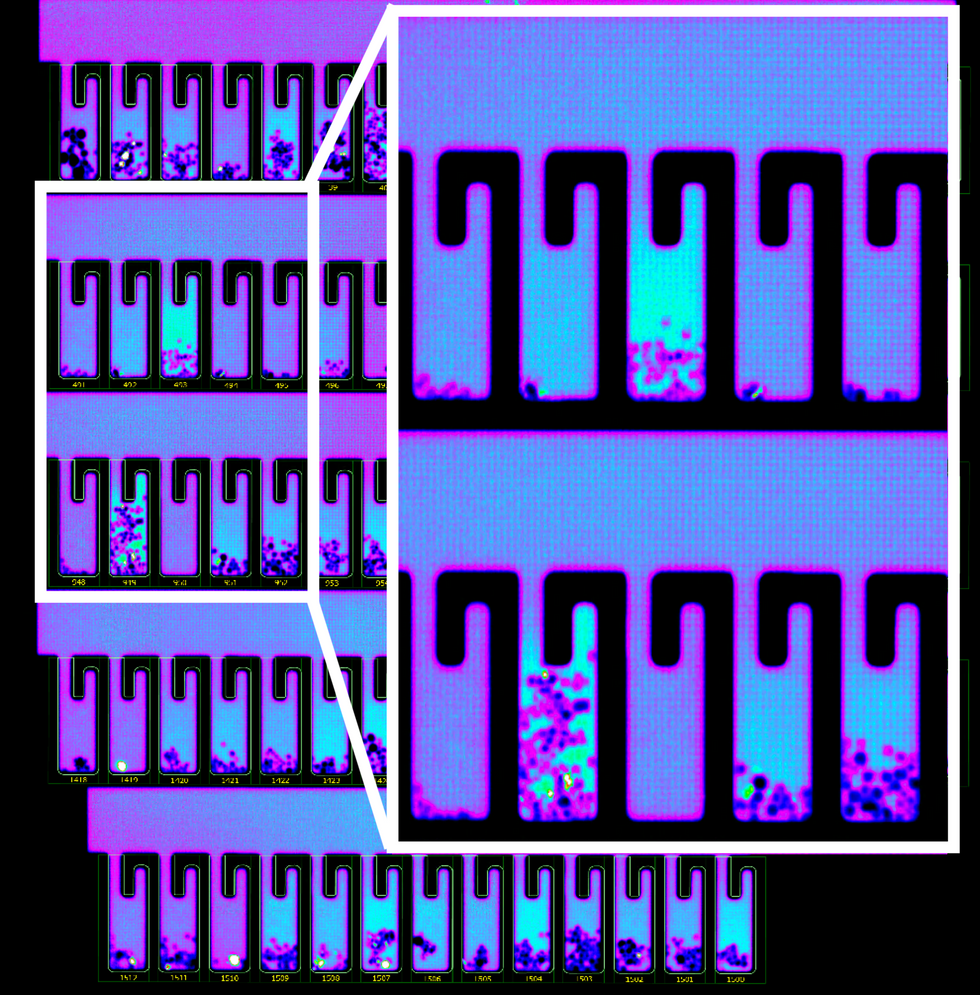
B-cells secreting antibodies inside the Berkeley Lights Beacon System Nano-Pens.
While vaccines are likely to take months to develop and test, antibodies might arrive to the battleground sooner. With the extremely limited treatment options for COVID-19, antibody-based therapeutics can potentially bridge this gap.
Lina Zeldovich has written about science, medicine and technology for Popular Science, Smithsonian, National Geographic, Scientific American, Reader’s Digest, the New York Times and other major national and international publications. A Columbia J-School alumna, she has won several awards for her stories, including the ASJA Crisis Coverage Award for Covid reporting, and has been a contributing editor at Nautilus Magazine. In 2021, Zeldovich released her first book, The Other Dark Matter, published by the University of Chicago Press, about the science and business of turning waste into wealth and health. You can find her on http://linazeldovich.com/ and @linazeldovich.
Have you felt a bit like an armchair epidemiologist lately? Maybe you've been poring over coronavirus statistics on your county health department's website or on the pages of your local newspaper.
If the percentage of positive tests steadily stays under 8 percent, that's generally a good sign.
You're likely to find numbers and charts but little guidance about how to interpret them, let alone use them to make day-to-day decisions about pandemic safety precautions.
Enter the gurus. We asked several experts to provide guidance for laypeople about how to navigate the numbers. Here's a look at several common COVID-19 statistics along with tips about how to understand them.
Case Counts: Consider the Context
The number of confirmed COVID-19 cases in American counties is widely available. Local and state health departments should provide them online, or you can easily look them up at The New York Times' coronavirus database. However, you need to be cautious about interpreting them.
"Case counts are the obvious numbers to look at. But they're probably the hardest thing to sort out," said Dr. Jeff Martin, an epidemiologist at the University of California at San Francisco.
That's because case counts by themselves aren't a good window into how the coronavirus is affecting your community since they rely on testing. And testing itself varies widely from day to day and community to community.
"The more testing that's done, the more infections you'll pick up," explained Dr. F. Perry Wilson, a physician at Yale University. The numbers can also be thrown off when tests are limited to certain groups of people.
"If the tests are being mostly given to people with a high probability of having been infected -- for example, they have had symptoms or work in a high-risk setting -- then we expect lots of the tests to be positive. But that doesn't tell us what proportion of the general public is likely to have been infected," said Eleanor Murray, an epidemiologist at Boston University.
These Stats Are More Meaningful
According to Dr. Wilson, it's more useful to keep two other statistics in mind: the number of COVID tests that are being performed in your community and the percentage that turn up positive, showing that people have the disease. (These numbers may or may not be available locally. Check the websites of your community's health department and local news media outlets.)
If the number of people being tested is going up, but the percentage of positive tests is going down, Dr. Wilson said, that's a good sign. But if both numbers are going up – the number of people tested and the percentage of positive results – then "that's a sign that there are more infections burning in the community."
It's especially worrisome if the percentage of positive cases is growing compared to previous days or weeks, he said. According to him, that's a warning of a "high-risk situation."
Dr. George Rutherford, an epidemiologist at University of California at San Francisco, offered this tip: If the percentage of positive tests steadily stays under 8 percent, that's generally a good sign.
There's one more caveat about case counts. It takes an average of a week for someone to be infected with COVID-19, develop symptoms, and get tested, Dr. Rutherford said. It can take an additional several days for those test results to be reported to the county health department. This means that case numbers don't represent infections happening right now, but instead are a picture of the state of the pandemic more than a week ago.
Hospitalizations: Focus on Current Statistics
You should be able to find numbers about how many people in your community are currently hospitalized – or have been hospitalized – with diagnoses of COVID-19. But experts say these numbers aren't especially revealing unless you're able to see the number of new hospitalizations over time and track whether they're rising or falling. This number often isn't publicly available, however.
If new hospitalizations are increasing, "you may want to react by being more careful yourself."
And there's an important caveat: "The problem with hospitalizations is that they do lag," UC San Francisco's Dr. Martin said, since it takes time for someone to become ill enough to need to be hospitalized. "They tell you how much virus was being transmitted in your community 2 or 2.5 weeks ago."
Also, he said, people should be cautious about comparing new hospitalization rates between communities unless they're adjusted to account for the number of more-vulnerable older people.
Still, if new hospitalizations are increasing, he said, "you may want to react by being more careful yourself."
Deaths: They're an Even More Delayed Headline
Cable news networks obsessively track the number of coronavirus deaths nationwide, and death counts for every county in the country are available online. Local health departments and media websites may provide charts tracking the growth in deaths over time in your community.
But while death rates offer insight into the disease's horrific toll, they're not useful as an instant snapshot of the pandemic in your community because severely ill patients are typically sick for weeks. Instead, think of them as a delayed headline.
"These numbers don't tell you what's happening today. They tell you how much virus was being transmitted 3-4 weeks ago," Dr. Martin said.
'Reproduction Value': It May Be Revealing
You're not likely to find an available "reproduction value" for your community, but it is available for your state and may be useful.
A reproduction value, also known as R0 or R-naught, "tells us how many people on average we expect will be infected from a single case if we don't take any measures to intervene and if no one has been infected before," said Boston University's Murray.
As The New York Times explained, "R0 is messier than it might look. It is built on hard science, forensic investigation, complex mathematical models — and often a good deal of guesswork. It can vary radically from place to place and day to day, pushed up or down by local conditions and human behavior."
It may be impossible to find the R0 for your community. However, a website created by data specialists is providing updated estimates of a related number -- effective reproduction number, or Rt – for each state. (The R0 refers to how infectious the disease is in general and if precautions aren't taken. The Rt measures its infectiousness at a specific time – the "t" in Rt.) The site is at rt.live.
"The main thing to look at is whether the number is bigger than 1, meaning the outbreak is currently growing in your area, or smaller than 1, meaning the outbreak is currently decreasing in your area," Murray said. "It's also important to remember that this number depends on the prevention measures your community is taking. If the Rt is estimated to be 0.9 in your area and you are currently under lockdown, then to keep it below 1 you may need to remain under lockdown. Relaxing the lockdown could mean that Rt increases above 1 again."
"Whether they're on the upswing or downswing, no state is safe enough to ignore the precautions about mask wearing and social distancing."
Keep in mind that you can still become infected even if an outbreak in your community appears to be slowing. Low risk doesn't mean no risk.
Putting It All Together: Why the Numbers Matter
So you've reviewed COVID-19 statistics in your community. Now what?
Dr. Wilson suggests using the data to remind yourself that the coronavirus pandemic "is still out there. You need to take it seriously and continue precautions," he said. "Whether they're on the upswing or downswing, no state is safe enough to ignore the precautions about mask wearing and social distancing. 'My state is doing well, no one I know is sick, is it time to have a dinner party?' No."
He also recommends that laypeople avoid tracking COVID-19 statistics every day. "Check in once a week or twice a month to see how things are going," he suggested. "Don't stress too much. Just let it remind you to put that mask on before you get out of your car [and are around others]."