Your Community and COVID-19: How to Make Sense of the Numbers Where You Live

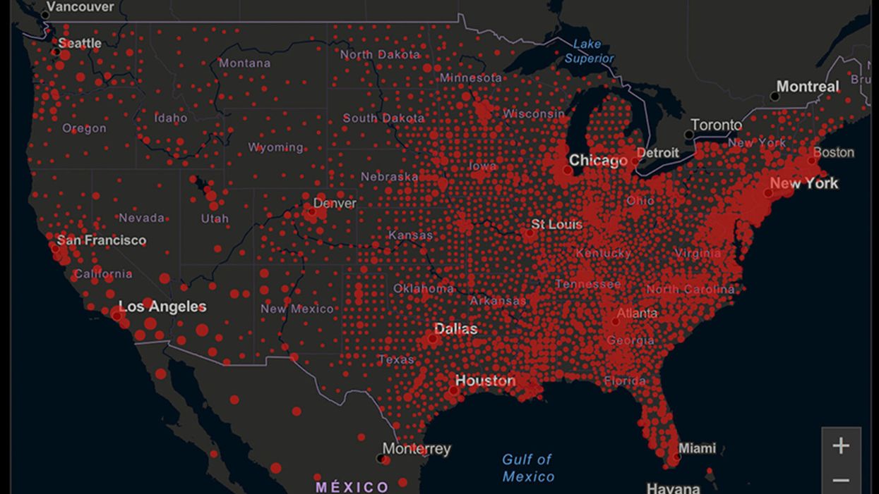
A map of cumulative known cases of COVID-19 in the U.S., as of June 12th, 2020.
Have you felt a bit like an armchair epidemiologist lately? Maybe you've been poring over coronavirus statistics on your county health department's website or on the pages of your local newspaper.
If the percentage of positive tests steadily stays under 8 percent, that's generally a good sign.
You're likely to find numbers and charts but little guidance about how to interpret them, let alone use them to make day-to-day decisions about pandemic safety precautions.
Enter the gurus. We asked several experts to provide guidance for laypeople about how to navigate the numbers. Here's a look at several common COVID-19 statistics along with tips about how to understand them.
Case Counts: Consider the Context
The number of confirmed COVID-19 cases in American counties is widely available. Local and state health departments should provide them online, or you can easily look them up at The New York Times' coronavirus database. However, you need to be cautious about interpreting them.
"Case counts are the obvious numbers to look at. But they're probably the hardest thing to sort out," said Dr. Jeff Martin, an epidemiologist at the University of California at San Francisco.
That's because case counts by themselves aren't a good window into how the coronavirus is affecting your community since they rely on testing. And testing itself varies widely from day to day and community to community.
"The more testing that's done, the more infections you'll pick up," explained Dr. F. Perry Wilson, a physician at Yale University. The numbers can also be thrown off when tests are limited to certain groups of people.
"If the tests are being mostly given to people with a high probability of having been infected -- for example, they have had symptoms or work in a high-risk setting -- then we expect lots of the tests to be positive. But that doesn't tell us what proportion of the general public is likely to have been infected," said Eleanor Murray, an epidemiologist at Boston University.
These Stats Are More Meaningful
According to Dr. Wilson, it's more useful to keep two other statistics in mind: the number of COVID tests that are being performed in your community and the percentage that turn up positive, showing that people have the disease. (These numbers may or may not be available locally. Check the websites of your community's health department and local news media outlets.)
If the number of people being tested is going up, but the percentage of positive tests is going down, Dr. Wilson said, that's a good sign. But if both numbers are going up – the number of people tested and the percentage of positive results – then "that's a sign that there are more infections burning in the community."
It's especially worrisome if the percentage of positive cases is growing compared to previous days or weeks, he said. According to him, that's a warning of a "high-risk situation."
Dr. George Rutherford, an epidemiologist at University of California at San Francisco, offered this tip: If the percentage of positive tests steadily stays under 8 percent, that's generally a good sign.
There's one more caveat about case counts. It takes an average of a week for someone to be infected with COVID-19, develop symptoms, and get tested, Dr. Rutherford said. It can take an additional several days for those test results to be reported to the county health department. This means that case numbers don't represent infections happening right now, but instead are a picture of the state of the pandemic more than a week ago.
Hospitalizations: Focus on Current Statistics
You should be able to find numbers about how many people in your community are currently hospitalized – or have been hospitalized – with diagnoses of COVID-19. But experts say these numbers aren't especially revealing unless you're able to see the number of new hospitalizations over time and track whether they're rising or falling. This number often isn't publicly available, however.
If new hospitalizations are increasing, "you may want to react by being more careful yourself."
And there's an important caveat: "The problem with hospitalizations is that they do lag," UC San Francisco's Dr. Martin said, since it takes time for someone to become ill enough to need to be hospitalized. "They tell you how much virus was being transmitted in your community 2 or 2.5 weeks ago."
Also, he said, people should be cautious about comparing new hospitalization rates between communities unless they're adjusted to account for the number of more-vulnerable older people.
Still, if new hospitalizations are increasing, he said, "you may want to react by being more careful yourself."
Deaths: They're an Even More Delayed Headline
Cable news networks obsessively track the number of coronavirus deaths nationwide, and death counts for every county in the country are available online. Local health departments and media websites may provide charts tracking the growth in deaths over time in your community.
But while death rates offer insight into the disease's horrific toll, they're not useful as an instant snapshot of the pandemic in your community because severely ill patients are typically sick for weeks. Instead, think of them as a delayed headline.
"These numbers don't tell you what's happening today. They tell you how much virus was being transmitted 3-4 weeks ago," Dr. Martin said.
'Reproduction Value': It May Be Revealing
You're not likely to find an available "reproduction value" for your community, but it is available for your state and may be useful.
A reproduction value, also known as R0 or R-naught, "tells us how many people on average we expect will be infected from a single case if we don't take any measures to intervene and if no one has been infected before," said Boston University's Murray.
As The New York Times explained, "R0 is messier than it might look. It is built on hard science, forensic investigation, complex mathematical models — and often a good deal of guesswork. It can vary radically from place to place and day to day, pushed up or down by local conditions and human behavior."
It may be impossible to find the R0 for your community. However, a website created by data specialists is providing updated estimates of a related number -- effective reproduction number, or Rt – for each state. (The R0 refers to how infectious the disease is in general and if precautions aren't taken. The Rt measures its infectiousness at a specific time – the "t" in Rt.) The site is at rt.live.
"The main thing to look at is whether the number is bigger than 1, meaning the outbreak is currently growing in your area, or smaller than 1, meaning the outbreak is currently decreasing in your area," Murray said. "It's also important to remember that this number depends on the prevention measures your community is taking. If the Rt is estimated to be 0.9 in your area and you are currently under lockdown, then to keep it below 1 you may need to remain under lockdown. Relaxing the lockdown could mean that Rt increases above 1 again."
"Whether they're on the upswing or downswing, no state is safe enough to ignore the precautions about mask wearing and social distancing."
Keep in mind that you can still become infected even if an outbreak in your community appears to be slowing. Low risk doesn't mean no risk.
Putting It All Together: Why the Numbers Matter
So you've reviewed COVID-19 statistics in your community. Now what?
Dr. Wilson suggests using the data to remind yourself that the coronavirus pandemic "is still out there. You need to take it seriously and continue precautions," he said. "Whether they're on the upswing or downswing, no state is safe enough to ignore the precautions about mask wearing and social distancing. 'My state is doing well, no one I know is sick, is it time to have a dinner party?' No."
He also recommends that laypeople avoid tracking COVID-19 statistics every day. "Check in once a week or twice a month to see how things are going," he suggested. "Don't stress too much. Just let it remind you to put that mask on before you get out of your car [and are around others]."
In this week's Friday Five, breathing this way may cut down on anxiety, a fasting regimen that could make you sick, this type of job makes men more virile, 3D printed hearts could save your life, and the role of metformin in preventing dementia.
The Friday Five covers five stories in research that you may have missed this week. There are plenty of controversies and troubling ethical issues in science – and we get into many of them in our online magazine – but this news roundup focuses on scientific creativity and progress to give you a therapeutic dose of inspiration headed into the weekend.
Here are the promising studies covered in this week's Friday Five, featuring interviews with Dr. David Spiegel, associate chair of psychiatry and behavioral sciences at Stanford, and Dr. Filip Swirski, professor of medicine and cardiology at the Icahn School of Medicine at Mount Sinai.
Listen on Apple | Listen on Spotify | Listen on Stitcher | Listen on Amazon | Listen on Google
Here are the promising studies covered in this week's Friday Five, featuring interviews with Dr. David Spiegel, associate chair of psychiatry and behavioral sciences at Stanford, and Dr. Filip Swirski, professor of medicine and cardiology at the Icahn School of Medicine at Mount Sinai.
- Breathing this way cuts down on anxiety*
- Could your fasting regimen make you sick?
- This type of job makes men more virile
- 3D printed hearts could save your life
- Yet another potential benefit of metformin
* This video with Dr. Andrew Huberman of Stanford shows exactly how to do the breathing practice.
This podcast originally aired on March 3, 2023.
Breakthrough drones deliver breast milk in rural Uruguay
A drone hovers over Tacuarembó hospital in Uruguay, carrying its precious cargo: breast milk intended for children in remote parts of the country.
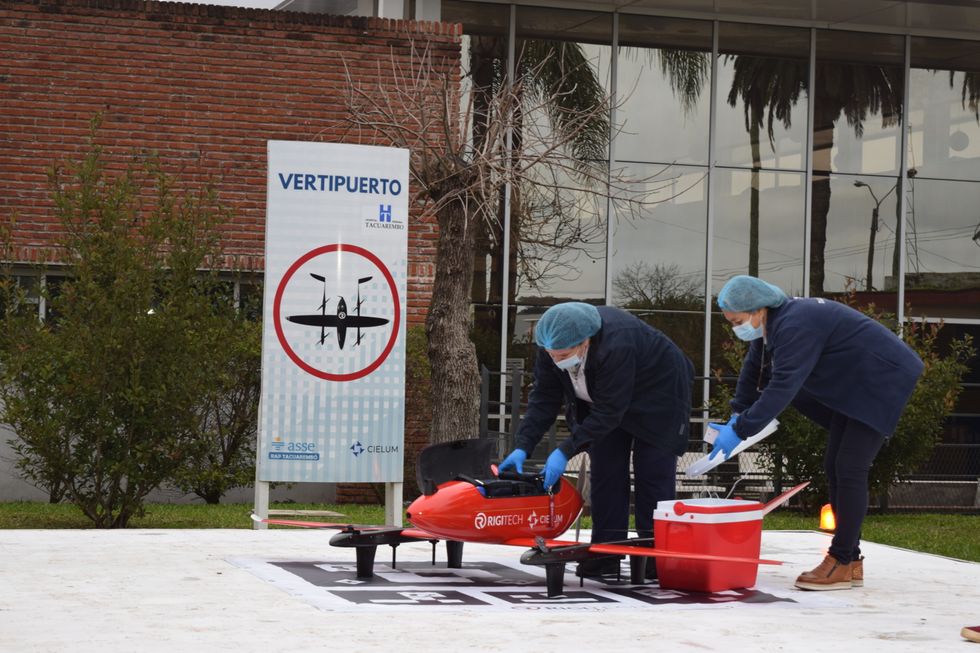
Until three months ago, nurse Leopoldina Castelli used to send bottles of breast milk to nourish babies in the remote areas of Tacuarembó, in northern Uruguay, by way of ambulances or military trucks. That is, if the vehicles were available and the roads were passable, which wasn’t always the case. Now, five days per week, she stands by a runway at the hospital, located in Tacuarembó’s capital, watching a drone take off and disappear from view, carrying the milk to clinics that serve the babies’ families.
The drones can fly as far as 62 miles. Long distances and rough roads are no obstacles. The babies, whose mothers struggle to produce sufficient milk and cannot afford formula, now receive ample supplies for healthy growth. “Today we provided nourishment to a significantly larger number of children, and this is something that deeply moves me,” Castelli says.
About two decades ago, the Tacuarembó hospital established its own milk bank, supported by donations from mothers across Tacuarembó. Over the years, the bank has provided milk to infants immediately after birth. It's helped drive a “significant and sustained” decrease in infant mortality, says the hospital director, Ciro Ferreira.
But these children need breast milk throughout their first six months, if not longer, to prevent malnutrition and other illnesses that are prevalent in rural Tacuarembó. Ground transport isn't quick or reliable enough to meet this goal. It can take several hours, during which the milk may spoil due to a lack of refrigeration.
The battery-powered drones have been the difference-maker. The project to develop them, financed by the UNICEF Innovation Fund, is the first of its kind in Latin America. To Castelli, it's nothing short of a revolution. Tacuarembó Hospital, along with three rural clinics in the most impoverished part of Uruguay, are its leaders.
"This marks the first occasion when the public health system has been directly impacted [by our technology]," says Sebastián Macías, the CEO and co-founder of Cielum, an engineer at the University Republic, which collaborated on the technology with a Uruguayan company called Cielum and a Swiss company, Rigitech.
The drone can achieve a top speed of up to 68 miles per hour, is capable of flying in light rain, and can withstand winds of up to 30 miles per hour at a maximum altitude of 120 meters.
"We have succeeded in embracing the mothers from rural areas who were previously slipping through the cracks of the system," says Ferreira, the hospital director. He envisions an expansion of the service so it can improve health for children in other rural areas.

Nurses load the drone for breast milk delivery.
Sebastián Macías - Cielum
The star aircraft
The drone, which costs approximately $70,000, was specifically designed for the transportation of biological materials. Constructed from carbon fiber, it's three meters wide, two meters long and weighs 42 pounds when fully loaded. Additionally, it is equipped with a ballistic parachute to ensure a safe descent in case the technology fails in midair. Furthermore, it can achieve a top speed of 68 miles per hour, fly in light rain, and withstand winds of 30 miles per hour at a height of 120 meters.
Inside, the drones feature three refrigerated compartments that maintain a stable temperature and adhere to the United Nations’ standards for transporting perishable products. These compartments accommodate four gallons or 6.5 pounds of cargo. According to Macías, that's more than sufficient to carry a week’s worth of milk for one infant on just two flights, or 3.3 pounds of blood samples collected in a rural clinic.
“From an energy perspective, it serves as an efficient mode of transportation and helps reduce the carbon emissions associated with using an ambulance,” said Macías. Plus, the ambulance can remain available in the town.
Macías, who has led software development for the drone, and three other technicians have been trained to operate it. They ensure that the drone stays on course, monitor weather conditions and implement emergency changes when needed. The software displays the in-flight positions of the drones in relation to other aircraft. All agricultural planes in the region receive notification about the drone's flight path, departure and arrival times, and current location.
The future: doubling the drone's reach
Forty-five days after its inaugural flight, the drone is now making five flights per week. It serves two routes: 34 miles to Curtina and 31 miles to Tambores. The drone reaches Curtina in 50 minutes while ambulances take double that time, partly due to the subpar road conditions. Pueblo Ansina, located 40 miles from the state capital, will soon be introduced as the third destination.
Overall, the drone’s schedule is expected to become much busier, with plans to accomplish 20 weekly flights by the end of October and over 30 in 2024. Given the drone’s speed, Macías is contemplating using it to transport cancer medications as well.
“When it comes to using drones to save lives, for us, the sky is not the limit," says Ciro Ferreira, Tacuarembó hospital director.
In future trips to clinics in San Gregorio de Polanco and Caraguatá, the drone will be pushed to the limit. At these locations, a battery change will be necessary, but it's worth it. The route will cover up to 10 rural Tacuarembó clinics plus one hospital outside Tacuarembó, in Rivera, close to the border with Brazil. Currently, because of a shortage of ambulances, the delivery of pasteurized breast milk to Rivera only occurs every 15 days.
“The expansion to Rivera will include 100,000 more inhabitants, doubling the healthcare reach,” said Ferreira, the director of the Tacuarembó Hospital. In itself, Ferreira's hospital serves the medical needs of 500,000 people as one of the largest in Uruguay's interior.
Alejandro Del Estal, an aeronautical engineer at Rigitech, traveled from Europe to Tacuarembó to oversee the construction of the vertiports – the defined areas that can support drones’ take-off and landing – and the first flights. He pointed out that once the flight network between hospitals and rural polyclinics is complete in Uruguay, it will rank among the five most extensive drone routes in the world for any activity, including healthcare and commercial uses.
Cielum is already working on the long-term sustainability of the project. The aim is to have more drones operating in other rural regions in the western and northern parts of the country. The company has received inquiries from Argentina and Colombia, but, as Macías pointed out, they are exercising caution when making commitments. Expansion will depend on the development of each country’s regulations for airspace use.
For Ferreira, the advantages in Uruguay are evident: "This approach enables us to bridge the geographical gap, enhance healthcare accessibility, and reduce the time required for diagnosing and treating rural inhabitants, all without the necessity of them traveling to the hospital,” he says. "When it comes to using drones to save lives, for us, the sky is not the limit."

